Friday, May 21, 2010
Wednesday, May 19, 2010
Extra 2
Fast Shutter: Frozen in Motion
Still life: Grouped Objects
Portrait: Candid
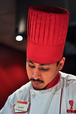
This candid portrait was taken at the Benihana restaurant in Burlingame. My chef was very focused on his cooking. I took advantage of the situation and snapped a shot of him while he was concentrating on cooking. After taking the photo, however, I edited some of the lighting and sharpening of the photo.
Still life: Single Object
Slow Shutter: Movement Blurred
Principle of Design: Symmetry (Radial)
Principle of Design: Movement
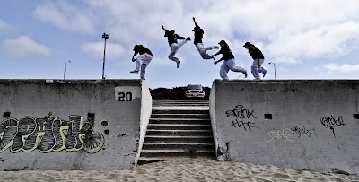 This is a Photoshop altered image created through multiple shots and combined into one image. The movement created by the multiple figures is what catches the viewers' eyes. There is also symmetry created by the two walls and staircase. This image was taken at Ocean Beach, San Fracisco in the mid-afternoon. Model: Tyrell Bernardo
Micro Lens/Zoom: Texture emphasized
Great Depth of Field
 This is a picture of my brother holding his PSP and is was part of my photo essay earlier in the year. The topic of this "essay" was a day in the life of a 9 year old. I used my brother as my main subject and followed him throughout a period of time, capturing the essence of what it is to be a child of his age. I used an aperture of f/1.8 which created a very shallow depth of field.
Element of Art: Lines
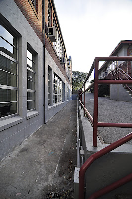 The Element of Art represented by this picture is the 'line.' Lines are found throughout the whole picture: the windows the left, the railing to the right, and the pathway in the center. These lines create movement, which is a principle of design, which leads the eye to the center of the image. This photo was taken at Mercy Burlingame in the morning (7-8 am).
Landscape Photograph in Black and White
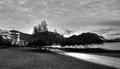 This picture emulates the style of photographer Ansel Adams. This was taken in Brisbane, California during the late afternoon. It was taken in color but changed to black and white and also post-processed/editted in Photoshop to create a very dramatic image, which is very common in most Ansel Adams photos. Also, an element of art found is the line created by the path and a principle of design found is the movement created by the path.
Mercy Street: Photojournalism
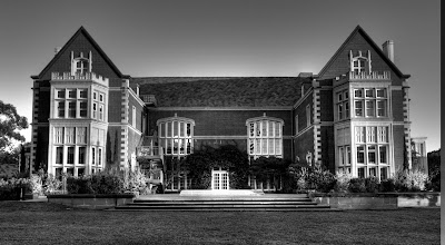 This photojournalistic image tells of Mercy as it used to only serve as one's beautiful dwelling place. The black and white emphasizes the building's age while the crispness and quality of the photo conveys the building's grandeur. This image of Mercy high school consists of three different pictures of the same scene, but at different exposures, merged into one (this technique is known as High Dynamic Range). By using this technique, nearly every detail in the picture, such as the blades of glass or reflections on the windows, can be seen in greater detail.
Tuesday, May 18, 2010
Element of Art: Space
Autobiographical Photo/Narrative
Subscribe to:
Posts (Atom)


